Showing posts with label janet klein. Show all posts

Sunday, June 18, 2017

FLOWERS ...SDC275 wk2


Theres still time to take part in the Stampotique Designer's Challenge 'FLOWERS'.

For my contribution, I used one of the sets by Eileen Hull  to create this journal.

To begin with I 'applied' ALDI pastel paints (just cheap kids paints) with my fingers ...ok so smeared would have been a more accurate description lol...and glued the panels together. With this set you can lace up the pieces but I preferred a more solid structure (plus the lace thread I had didnt work with the layout I had in mind)


I stencilled and inked areas, highlighted the stencilled circles with pen...and added some stamping directly to the surface


I glued on the letters creating the phrase and added some bits and bobs to decorate...


Added the Giant Daisy and Flamingo & co.


Made an inside  pocket to hold pages


DA-DAAAAAH.

Stamps used are all by Stampotique

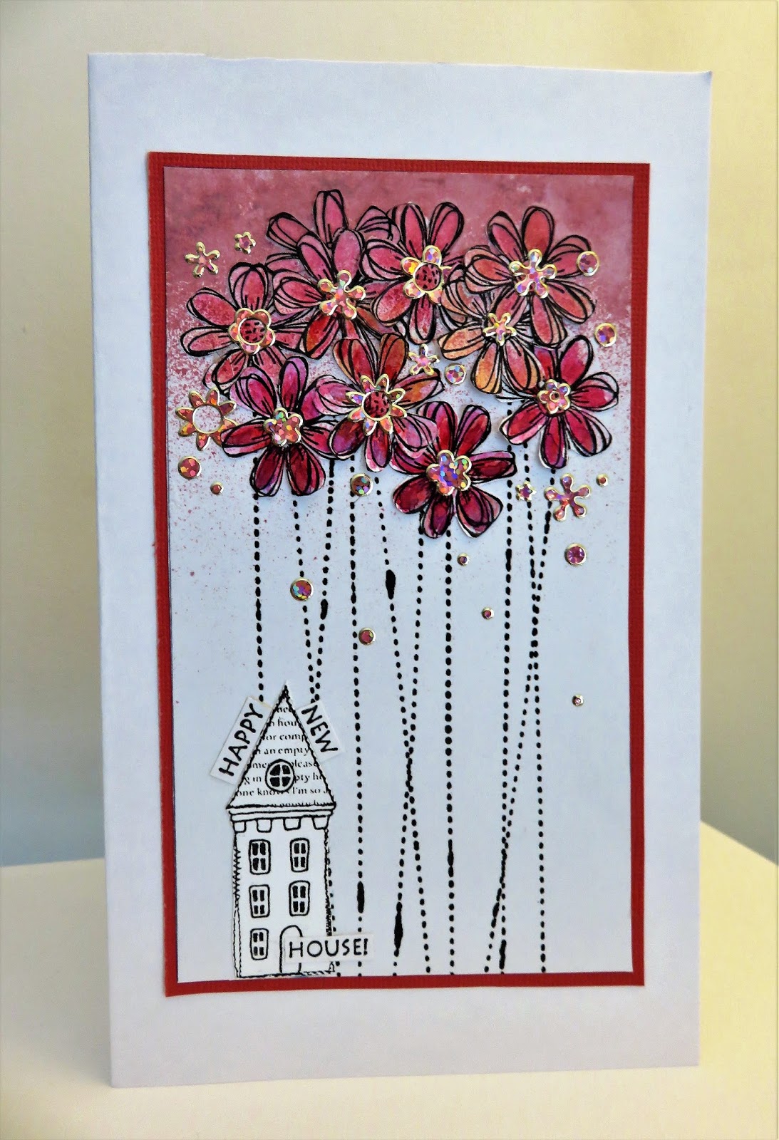
GIANT DAISY #3058 (Jo Capper-Sandon)

FLAMINGO #3061 (Jo Capper-Sandon)

DAISY DAISY #3002 (Jo Capper-Sandon)

BROLLY (the umbrella) #3083 (Jo Capper-Sandon)

IN STITCHES #8118 (Josie Cirincione)

ISABELLE #15011 (Tracy Scott)

ALPHA BACKGROUND (letters) #7431 (Arwen McCullen)

FLOWER BLOCK (flowers on flamingo) #9182 (Janet Klein)

Thanks to those that continue to support my blog.- really appreciate it xxx.. 
and for new visitors, all comments are gratefully received (takes ages to upload all these stamp links so gives me incentive to keep showing xx)

ps...I'm not really living the dream...haha...just a bit of artistic license ....like I dont ride round the village on my flamingo...or do I? ;)  All I can say is it would have to be a blimming strong flamingo haha

xxxxxxxxxxxxxxxx


Saturday, January 07, 2017

Less is More - #310 COLOUR

The Less is More challenge them this week is a colour challenge...OMBRE (meaning gradual shading /shadow of one colour to another)...

hmm...not sure if what I've made really shows gradual too well in the photos, sorry, but in real life the flowers really blend from a soft pink to quite a deep claret. I really wrestled with this card as it kept going 'wrong' or at least not how I envisaged it to be. And I thought I'd never hear myself say this but an ancient sheet of peel-offs really gave me the final touches that I was searching for. Who-da-thunk it?! :) 


The black 'smudge' appearance on the stems is part of the 'In Stitches' stamp design, representing areas of thread. .

You can see the richness of the flowers as the colour gradually gets darker below.


I tried colouring the house...nope, looked wrong, coloured the fascia of the house...nope...so I left it colourless. 


Stamps used are all by STAMPOTIQUE ORIGINALS. 

IN STITCHES (for flower stems)
STITCHED HOUSES (just one of them!)

Always love to play along with Less Is More...such a challenge keeping that clean fresh look.


Saturday, August 27, 2016

Two more for the Polka Dot Challenge


Its the second week of Stampotique Designer's Challenge and the continuing theme is

 POLKA DOTS.

I've made a couple more examples that might give you a few ideas .

Firstly , heres a bit of a fun card , nice and simple,

I used the wings from MEDIUM BEE(w/ tiny bee) 
 COOPER (the ghost) 
along with TYPEWRITER ALPHA


The second card is very much a contrast to the one above, but very polka dotty and still using the Bee stamp, this time BIG BEE


Thanks for stopping by. x Jo


Thursday, August 11, 2016

Less is More colour challenge #288 - Blue and Brown

BLUE AND BROWN...colours that look fabulous together but are a combination I rarely use...until this week when I spotted the Less Is More challenge theme #288 and decided to make a little butterfly range. The LIM challenges are always great for taking me in a direction not often visited and I always enjoy them.

I used  SMALL BUTTERFLY and ONE SECOND stamps , both from Stampotique Originals to create this postcard, card and ATC.

Hope you like them. The Butterfly is very versatile (I stamped it flat, painted it, left it black, cut it out, cut it in half and stamped more than once to create a faded look.).


The greetings card, just the top part of the wings are 3D


The ATC, watercoloured.


The faded effect card (although the left wing on the middle image didnt quite stamp evenly, sadly ....booo). The top butterfly is totally 3d.


MESSAGE TO LIMETTES.

...I checked the guidelines of the challenge as I was unsure on this occasion which photo to add to the link page on the challenge site...I've added the top main pic as I see them as a little set, but if this doesn't meet the guidelines please Limettes let me know and I will re-post one of the single creations on to the links page instead.

Thanks - Jo  x


Saturday, June 09, 2012

Summer Buzzin'


For a second week, Stampotique Originals are sponsoring the Less is More challenge. This week is quite a tricky one as it's 'Use a Flourish'. Now those of you that know Stampotique stamps well  will realise that flourishes don't dominate ANY of the artists ranges there and so the members of the Stampotique team that decided to take part all had to be a little extra creative by using our drawing skills, masks, templates, rub-ons, etc...and the extra twist for us  this week is its a OLC (a one layer challenge) too!

It's half term for the kids this week and my youngest lad has been REEEEEEEEALLY poorly, so a Less Is More challenge was just enough to get my head round for a 10 minute stamping fix  in between my Florence Nightingale sessions.


I used my Stampotique Medium Bee (which comes with a mini bee on the side of the stamp) which was the first stamp I ever designed and Enjoy Life, a really handy tiny text by Janet Klein for Stampotique. The scroll and dottiness were all rub-ons that I discovered in my stash. I coloured the bee with coloured pencils as it was nice and easy to sit with my poorly kiddo and colour quietly whilst he was asleep. Stampotique Stamps are available directly from Stampotique in the USA or many places here in the UK (please email me if you are searching for the range of stamps and cannot find a stockist)


Now.... Blogger is tricking me today and I seem to be unable to centre the above image, but I'm sure it won't make a great deal of difference ;0)
If you have a spare half an hour today, or this week even, why not join in LIM challenge and be in with a chance of winning a $30 gift certificate... you can use any stamps for the LIM challenge...

Don't forget to read the rules over on LIM first. :0)

I'm off to catch up with the kind comments I've been receiving this week as its quiet here at the moment on Nightingale Ward :0)

Thursday, April 12, 2012

No stamp images were harmed in the making of this card...

This last month I've had a few twists and turns with my style, trying out a few new things at the workshop I run, and also digging through all my old forgotten materials in my long lost stash of a craft space (see here lol).

The current Stampotique Designer's Challenge... Oodles of Doodles led me to making something very sketchy.


You may recognise 'Stella' from my range at Stampotique Originals. But on looking more closely you'll be able to see the difference- this is what Stella usually looks like....


For this challenge I chopped Stella in half and doodled a different lower half for her. I was aiming for a longer graceful body (I wish it was this easy in real life lol). I got her to sit more upright too then she could hold the butterfly. Then drew her a set of wings...


and doodled the area surrounding her whilst watching tv using a fine black waterproof pen. I added Daisy Daisy, Swirl Stalks (which are from my range at Stampotique and Janet Klein's Crow Line.

The colour was added with watercolour pencils. I use cheap Tesco ones, they do the job, for now anyway.

This style reminds me of how I used to draw when I used to keep a sketch book. I should start using one again I think, great for developing ideas.

Please check out all the other doodled contributions over on the Stampotique Challenge. To enter and be in with a chance of winning a $30 gift certificate all you need is a single Stampotique image in your stash to doodle around!(it's Stampotique stamps only nowadays don't forget).

Hope you like what I did...its strange working with stamps that I drew in the first place, I still haven't got used to it.

Sunday, March 11, 2012

Workshop Dates plus weekends! And a pattern overload photo frenzy!!


Hello again... where does the time go?

Firstly, I'm running a few workshop sessions again starting with March and April and the dates can be found over on my Workshop Blog here if you are interested in taking part in what always proves to be a really enjoyable few hours creating.

Meanwhile, back on this blog I have a number of pieces to share...

I have a feeling that pattern clash/overload/mix and match is the next up and coming craze- well thats my story and I'm sticking to it...it has nothing to do (honest *cough*) with the fact I need to use up some of this enormous back log of pre patterned paper filling up the so called craft mountain that used to be a walk in sit down room. At the moment I have to put my hand around the door and grab what I can.

It turns out though I REALLY REALLY enjoyed making these and will be doing some more as not only are they using up my scraps, but are, I feel, commercial enough to actually give out as cards to REAL 'NORMAL' PEOPLE!!!

HAHA, you know what I mean, I'm sure.

They are illustrating images from the wonderful Janet Klein, one of the stamp artists for Stampotique. Janet's latest range is based on Alice in Wonderland, something I have a penchant for (ooo 'ark at me going all French), which can be found half way down this page linked here.

As you can see below, I added more pattern on the insides!!


And got out the coloured pencils for the stamped images.


Happy Unbirthday is from my range at Stampotique, but goes well with Janet's range don't you think?


I popped the Mad Hatter into a heart shaped 'flower' and added some words. Just sitting here thinking of you is also from Stampotique.


And finally, my favourite (if we can have faves)...I really enjoyed making this one inparticular, it fell into place.


Who can resist Chessy's grin!!


Well this post took an aaaaaaaage to set up. A cuppa is well and truly needed. Hope you liked it. See ya soon xx And if you are local to me please check out my workshops.