hmm...not sure if what I've made really shows gradual too well in the photos, sorry, but in real life the flowers really blend from a soft pink to quite a deep claret. I really wrestled with this card as it kept going 'wrong' or at least not how I envisaged it to be. And I thought I'd never hear myself say this but an ancient sheet of peel-offs really gave me the final touches that I was searching for. Who-da-thunk it?! :)
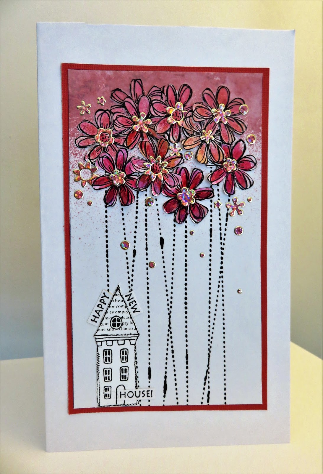
The black 'smudge' appearance on the stems is part of the 'In Stitches' stamp design, representing areas of thread. .
You can see the richness of the flowers as the colour gradually gets darker below.

I tried colouring the house...nope, looked wrong, coloured the fascia of the house...nope...so I left it colourless.

Stamps used are all by STAMPOTIQUE ORIGINALS.
IN STITCHES (for flower stems)
STITCHED HOUSES (just one of them!)
Always love to play along with Less Is More...such a challenge keeping that clean fresh look.
11 comments:
I've never been very good at shading; but love this! The flowers are so beautiful. Happy New Year to you, too.
Love this creative design. Simply eye catching. Thanks for sharing at Less is More!
Super stunning design and colours. Stand out card for me
Just beautiful! This really caught my eye at Less is More, and I had to come over for a closer look - LOVE it!
Jen xx
A striking, fun and fabulous techinque for ombre here. So eye-popping and rich in hue. Great idea for the challenge and thanks for playing along with us at Less is More this week. Sarah
Love the colours you've chosen! This is beautiful, Jo x
Such a beautiful card the colours are so pretty and I like the house left uncoloured its a great contrast with the flowers. Peel offs who would have thought of it indeed maybe the trend will come back !
Marie
JO this is fab and using peel offs reallylifted the design, amazing x
what a fabulous way to make an ombre card... stunning.. thanks for joining us at less is more this week. Jen xx
I love this - it's so contemporary and quirky.
Such an unusual way to create an ombre design but you've nailed it, the graduation of the flowers is beautiful.
Thanks so much for sharing with us at Less is More, Anita x
Post a Comment